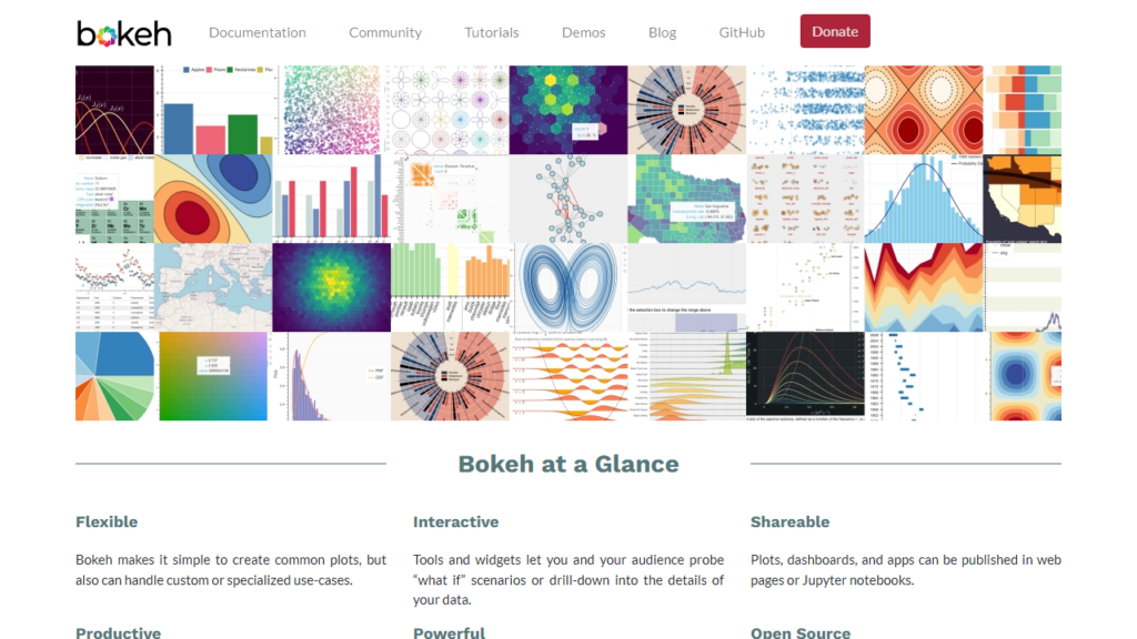
The basics of a Data visualization tool
Choosing the right data visualization tool for your needs is essential. Key features to look for include ease of use, the ability to handle your specific data volumes, the option to create customized dashboards, compatibility with your existing systems, and strong customer support.
Top Data Visualization Tools
There are numerous data visualization tools available in the market, each with their unique features, advantages, and disadvantages.
Let’s look at some of the top ones:
Infogram
Infogram is a web-based data visualization and infographics platform. It offers users a quick and easy way to visualize data in engaging, highly interactive formats. Users can choose from a wide variety of charts, maps, graphics, and dashboards to tell their data stories.
Features: Infogram offers over 35 interactive chart types, with options to make comparisons, show patterns, or display geographic data. In addition, it allows users to import data directly from spreadsheets, databases, or cloud services. It also supports real-time data, which updates visualizations automatically every time the data source changes.
Advantages: One of Infogram’s key strengths is its emphasis on design. It provides a wide range of customizable templates, ensuring that visual data is not just informative but also aesthetically pleasing. Users can seamlessly embed their visualizations into reports, presentations, or websites. Infogram also supports team collaboration, allowing multiple users to work on a project simultaneously.
Drawbacks: While Infogram offers a free version, its most advanced features are only available on the paid plans. Furthermore, while it does provide a variety of visualization methods, it doesn’t have the advanced analytical capabilities that some other tools offer.
Visme
Visme is an all-in-one visual content creation tool that is particularly popular for its data visualization capabilities. It combines an easy-to-use, drag-and-drop interface with a comprehensive set of features allowing users to create interactive and engaging graphs, charts, and infographics.
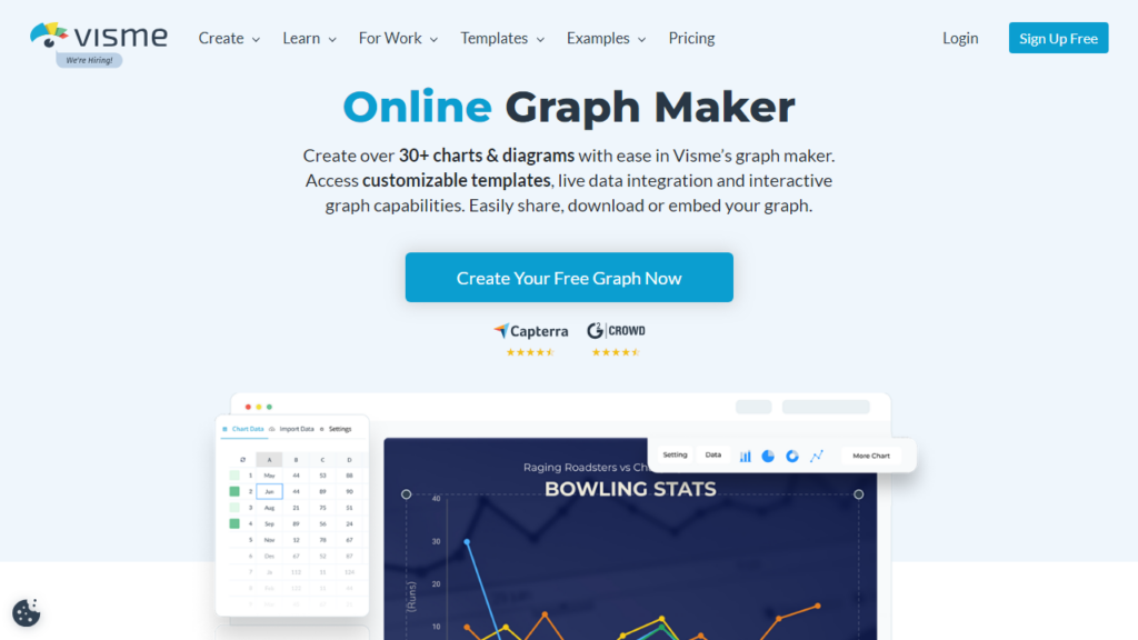
Features: Visme offers a variety of data visualization tools, including various chart types, maps, tables, radials, gauges, and more. It also allows for data import from spreadsheets or linking directly to live data. Additionally, Visme’s visualization tools include pre-designed themes and templates, animations, interactivity, and the ability to share or embed on other sites.
Advantages: Visme stands out for its user-friendly interface and flexibility, making it an excellent choice for those without much technical expertise. Functions like the automatic ‘data widget’ can convert raw data into engaging visuals automatically. Furthermore, Visme isn’t just limited to data visualization; users can also use it to create presentations, infographics, reports, and more.
Drawbacks: While Visme offers a free version, to unlock most advanced features, a premium subscription is required. Also, some users might find the variety of features and possibilities overwhelming, making the learning curve somewhat steeper.
Plotly
Plotly is a technical computing company that develops open-source software for data visualization. The tool’s highlight is its capacity to create intricate, publication-quality graphs.
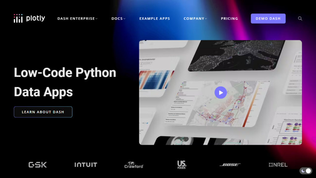
Features: Plotly supports over 40 unique chart types including 3D plots, geographic maps, and SVG images. It allows users to create interactive plots that can be embedded in websites or used in applications. Users can generate plots in Python, R, MATLAB, Perl, Julia, Arduino, and REST.
Advantages: Plotly provides developers with a platform to display their visual analytics in a high-level, interactive setting. It offers excellent interoperability with other tools and programming languages. Moreover, a major strength is the high-quality visual output of Plotly and its ability to handle multiple complex datasets.
Drawbacks: However, Plotly might not be the best option for beginners or those without a programming background, as it requires a good level of technical knowledge to fully utilize all its features. Also, while it does offer a free version, many of its premium features are locked behind a subscription fee.
Chartblocks
Chartblocks is a versatile online chart builder that stands out for its simplicity and ease-of-use. Users can create, customize and publish their charts without needing any coding skills. The tool supports a wide range of chart types and data import options, making it a practical solution for data visualization needs.
Features: Chartblocks provides an intuitive chart designer interface that allows users to build charts in mere minutes. The data can be imported directly from spreadsheets, databases, or even live feeds. Charts can be customized through a design wizard and can then be shared or embedded on websites or social media.
Advantages: Chartblocks is designed to be user-friendly, even for people without a technical background. It offers a storyboard feature, enabling users to narrate a story using their data visualization which can be useful in various sectors including marketing, journalism, and education. Additionally, the ability to import data directly from a variety of sources boosts its usability.
Drawbacks: Although Chartblocks provides a range of basic visualization types, it might not suit more complex, in-depth data analysis needs. Additional customization options are also somewhat limited compared to some other tools. While it offers a free version, there are limitations on the number of charts and data rows you can use.
Tableau Public
Tableau Public is the free version of the well-known Tableau data visualization tool, specifically designed for cost-conscious users who want to publish their data visualizations on the web. It is used widely in various industries to create and share interactive charts, graphs, and maps.
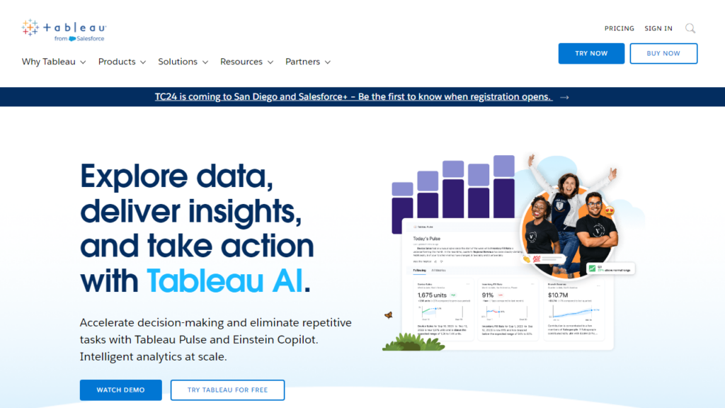
Features: Tableau Public comes with most of the data visualization features of its premium counterpart. It allows users to connect to a variety of data sources, including Excel, CSV files, and Google Sheets, and provides numerous chart types and customization options. Created visuals can be shared directly on social media or embedded into blogs and websites.
Advantages: The main advantage of Tableau Public is its robust functionality at zero cost. The platform offers a user-friendly drag-and-drop interface and rich data-visualization capabilities. It’s also well-regarded for its strong community support, where users can share their visualizations and learn from others.
Drawbacks: A key limitation of Tableau Public is that all your data and visualizations are made public on Tableau’s website, which isn’t suitable for confidential or sensitive data. The software also requires a certain learning curve, especially for beginners or non-technical users. Additionally, customer support may also be limited compared to the premium version.
Datawrapper
Datawrapper is a user-friendly data visualization tool specifically designed for journalists, developers, and designers. It enables users to create interactive and responsive charts, maps, and tables within a few minutes without any programming knowledge.
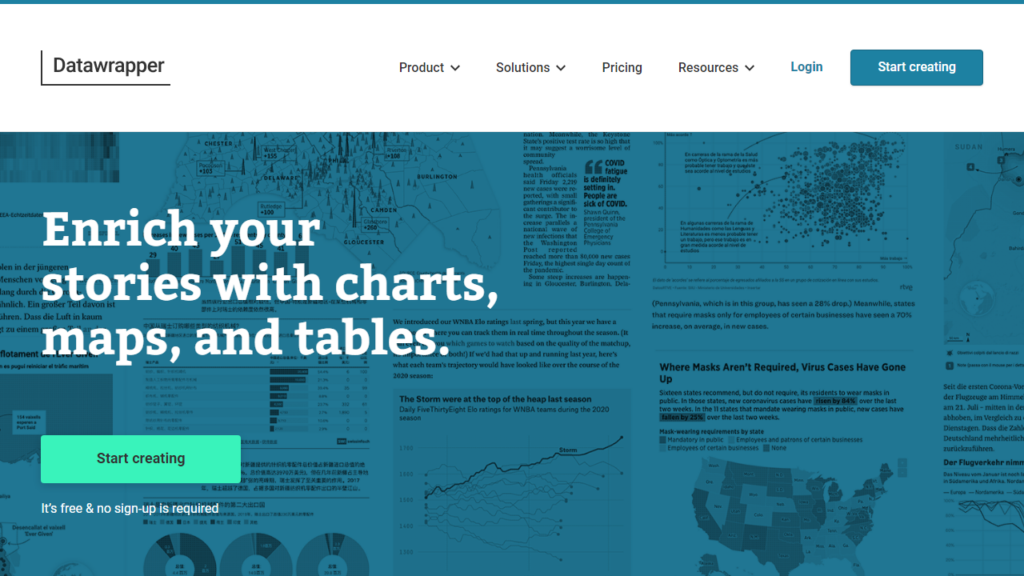
Features: Datawrapper offers a variety of chart types, including bar, line, pie, scatter, and area charts, and more. The platform allows you to import data from various sources, customize the design of the charts, and then embed them in your website. It also offers a feature to create responsive and interactive maps.
Advantages: Datawrapper stands out for its simplicity and focus on design. It’s a great tool for quick, clean, and attractive visualizations. The step-by-step guide provided by the tool aids in creating complex visualizations with ease. Also, the responsiveness of visualizations ensures that they look good on all device types.
Drawbacks: While Datawrapper offers a free version, many of its advanced features such as high-resolution exports and live-updating charts require a premium subscription. In addition, the tool doesn’t support as many data source types as some other tools, which could limit its usefulness for some users.
Datylon
Datylon is a data visualization tool that brings together the power of visual design and data analysis into one platform. With a library of customizable design templates and a user-friendly interface, Datylon allows users to create impactful data-driven infographics and visualizations quickly.
Features: Datylon provides a range of charts, maps, and infographic elements that users can customize to suit their specific needs. It supports importing data from Excel, CSV files, and Google Sheets, and allows for data editing directly within the tool. Additionally, it offers the Datylon for Illustrator plugin, facilitating the addition of complex charts to Adobe Illustrator designs.
Advantages: Datylon excels in its focus on design quality, supporting the creation of visually appealing and impactful infographics. Its user-friendly interface and heatmap visualization make data interpretation easy. The compatibility with Adobe Illustrator is a definite advantage for people with a graphic design background.
Drawbacks: Despite its strengths, Datylon might appear to be less robust in advanced data analytics compared to other tools. Furthermore, although it does offer a free version, access to certain advanced features and design capabilities are available only to premium users.
Easel.ly
Easel.ly is a web-based infographic tool that specializes in helping users create attractive, informative infographics. It’s a great tool for users who want to visualize ideas, concepts, and data creatively.
Features: Easel.ly provides a huge library of infographic templates that users can customize using a simple drag and drop interface. It allows users to insert shapes, lines, text, and also upload their own images and backgrounds. Once created, the infographics can be exported in various formats, including JPEG, PNG, and PDF.
Advantages: Ease of use is one of the key advantages of Easel.ly. Even without design skills, users can create professional-looking infographics in minutes. This is great for education, marketing, human resources, and other fields that depend on visual content to convey information.
Drawbacks: Easel.ly doesn’t support as many chart types or advanced data visualization features as some other tools. Also, its extensive library of templates and design elements are fully accessible only to premium subscribers. So while it’s well-suited for infographics, it may not be the best choice for more complex data visualizations.
Rawgraphs
Rawgraphs is an open-source data visualization tool that’s built to provide users with a flexible and easy way to create digital data visualizations. The tool is web-based and intended for designers and developers looking to create custom, complex data visualization.
Features: Rawgraphs supports a wide range of chart types, including those that aren’t often available in other data visualization tools. It allows users to import data in various formats (including CSV, TSV, and JSON), and maps your data into visual variables that represent dimensions, which users can then manipulate directly. The finished visualizations can be exported as vector (SVG) or raster (PNG) images.
Advantages: The greatest advantage of Rawgraphs is its flexibility. Users can create highly customized, complex visualizations that fit their exact needs. Besides, it being an open-source tool means it’s freely available, and its web-based nature makes it accessible from any platform.
Drawbacks: One downside to Rawgraphs is that it doesn’t allow users to interact with the visualizations directly on the tool. Also, the learning curve can be steep for users without data visualization experience, and the user interface, while clean, may appear too minimalistic for some users.
In conclusion
As we progress further into the digital age, data visualization has proven to be a key skill in various sectors. The right data visualization tool can not only help in understanding complex datasets but also in communicating insights effectively.

