Data visualization is a crucial aspect of data analysis, providing insights into patterns, trends, and relationships within your datasets. Pandas, in conjunction with popular plotting libraries like Matplotlib, simplifies the process of creating compelling visualizations. In this blog post, we’ll explore various techniques of plotting and visualization with Pandas.
Line Plot : a basic to Plotting and Visualizing with Pandas
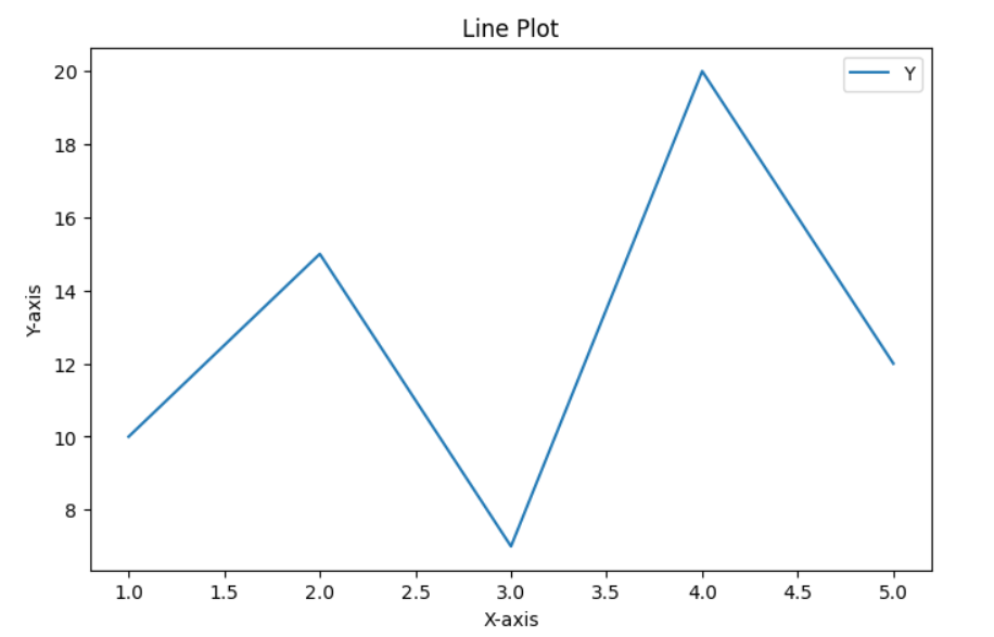
A Line Plot is a fundamental and versatile data visualization technique used to display the relationship between two continuous variables over a specific domain. This graphical representation shows trends, patterns, or changes in the dataset by connecting data points with straight lines to create a continuous line. To create a basic line plot using the plot() method:
import pandas as pd
import matplotlib.pyplot as plt

# Creating a DataFrame
data = {'X': [1, 2, 3, 4, 5], 'Y': [10, 15, 7, 20, 12]}
df = pd.DataFrame(data)

# Plotting a line chart
df.plot(x='X', y='Y', kind='line', figsize=(8, 5))
plt.title('Line Plot')
plt.xlabel('X-axis')
plt.ylabel('Y-axis')
plt.show()
Results from above Line Plot

Bar Plot :
A Bar Plot, also known as a Bar Chart or Bar Graph, is a common and effective data visualization technique used to represent categorical data. In this graphical representation, rectangular bars are used to depict the values of different categories, with the length of each bar corresponding to the magnitude of the data it represents. Visualize categorical data with a bar plot.
# Plotting a bar chart
df.plot(x='X', y='Y', kind='bar', figsize=(8, 5), color='skyblue')
plt.title('Bar Plot')
plt.xlabel('X-axis')
plt.ylabel('Y-axis')
plt.show()
Scatter Plot : a powerful data visualization tool
A Scatter Plot is a powerful data visualization tool that displays individual data points on a two-dimensional graph, with one variable on the x-axis and another on the y-axis. Each point represents the intersection of values for the two variables, allowing for the examination of the relationship between them. Scatter Plots are particularly useful for identifying patterns, trends, correlations, and outliers in the data. Explore relationships between two numerical variables using a scatter plot:
# Plotting a scatter plot
df.plot(x='X', y='Y', kind='scatter', figsize=(8, 5), color='green')
plt.title('Scatter Plot')
plt.xlabel('X-axis')
plt.ylabel('Y-axis')
plt.show()
Box Plot:
A Box Plot, also known as a Box-and-Whisker Plot, is a statistical data visualization tool that provides a concise summary of the distribution of a dataset. It displays key statistical measures such as the median, quartiles, and potential outliers. The plot consists of a rectangular “box” that represents the interquartile range (IQR) between the first quartile (Q1) and the third quartile (Q3). Inside the box is a line representing the median. Visualize the distribution of data and identify outliers with a box plot:
# Plotting a box plot
df.plot(kind='box', figsize=(8, 5))
plt.title('Box Plot')
plt.show()
Area Plot:
An Area Plot, also known as an Area Chart, is a data visualization method that represents quantitative data over a continuous interval or time span. Similar to a Line Plot, an Area Plot displays the magnitude of different variables, but in this case, the space between the line and the axis is filled with color, creating an enclosed area. The resulting visual emphasizes not only the individual data trends but also the overall magnitude and cumulative effect of the variables. Highlight the area between two lines to emphasize trends:
# Plotting an area chart
df.plot(x='X', y='Y', kind='area', figsize=(8, 5), alpha=0.5)
plt.title('Area Plot')
plt.xlabel('X-axis')
plt.ylabel('Y-axis')
plt.show()
Customizing Plots : an advanced approach to Plotting and visualization with Pandas
Pandas integrates with Matplotlib, allowing you to customize your plots further.
# Customizing a line plot
df.plot(x='X', y='Y', kind='line', figsize=(8, 5), linestyle='--', marker='o', color='purple', label='Data')
plt.title('Customized Line Plot')
plt.xlabel('X-axis')
plt.ylabel('Y-axis')
plt.legend()
plt.show()
Conclusion:
Pandas provides a user-friendly interface for creating a wide range of plots and visualizations. Whether you’re exploring trends, comparing values, or identifying patterns, Pandas, along with Matplotlib, makes the process intuitive and efficient. Incorporate these techniques of plotting and visualization with Pandas into your data analysis workflow, and you’ll be able to communicate your findings effectively through impactful visualizations.
