Data visualization is an essential aspect of data science, machine learning, and artificial intelligence. It allows us to understand complex data and derive useful insights by representing data in a graphical or pictorial format. Data visualization in Python plays a significant role due to the simplicity and robustness of the language.
From straightforward 2D graphs to intricate 3D visualizations, Python provides a multitude of libraries for data visualization users to choose from. But, for those who are just getting started, the sheer number of libraries available can be daunting. To help you narrow down your options, this article provides a concise overview of the most popular Python data visualization libraries used by machine learning and data science professionals.
Understanding Data Visualization
Data visualization is the graphic representation of data. It involves producing images that communicate relationships among the represented data to viewers of the images. This communication is achieved through the use of systematic mapping between graphic marks and data values in the creation of the visualization.
The data visualization produced by this mapping process gives viewers insight into the data when they examine it. Data visualization can be used to forecast sales volumes, pinpoint areas in need of maintenance or improvement, make clear which factors affect customer behavior, and comprehend which products to place where.
Python has a rich ecosystem of data visualization libraries, which automate the process of transforming raw, often hard-to-grasp data into understandable, visual formats. The Python data visualization libraries help data scientists visualize patterns, trends, correlations, and outliers in data that are difficult to understand in raw, numerical format. These libraries have found extensive acceptance in the data science community because of their ease of use, flexibility, and robustness.
Python’s flexibility and wide range of libraries make it a popular choice for data visualization in different fields of study. In the forthcoming sections, we will discuss some of the top Python data visualization libraries, offering a brief overview, use-cases, and comparative analysis of each.
Python and Data Visualization
Python has emerged as one of the most popular programming languages for data visualization due to its simplicity, flexibility, and vast selection of libraries. Python’s simpleness and readability make it a great language for beginners. Its flexibility means it can handle a wide range of data manipulation tasks, making it suitable for complex data visualization scenarios.
Python’s wide range of data manipulation libraries allows for transforming data into a format suitable for visual representation. Pandas is a popular Python library facilitating data manipulation, and NumPy is heavily used for numerical computations. These libraries can work together with data visualization libraries to create comprehensive data analysis pipelines.
Python’s data visualization libraries, such as Matplotlib, Seaborn, and Plotly facilitate visualizing data in various ways, such as via histograms, bar charts, pie charts, scatter plots, and more. These libraries also offer advanced visualization features, like interactive plots, three-dimensional graphics, and geospatial data visualizations, offering great customization possibilities.
In conclusion, Python, with its versatile features and libraries, has definitely established itself as a vital tool in the world of data visualization. In the next sections, we will dive more deeply into the top Python data visualization libraries, their features, and their application in data science.
Top Python Data Visualization Libraries
The vast collection of Python libraries is one of the main reasons why Python has become such a powerful tool for data visualization. Although these libraries offer a plethora of data visualization techniques, each has its own strengths, weaknesses, and specialties.
In the next sections of this blog, we will delve deeper into some of the most widely used Python libraries for data visualization. Particular emphasis will be placed on their respective advantages, areas of application, and unique features.
We hope you will gain a more profound understanding of these libraries, which will significantly aid your journey in the field of data science. Whether you are a beginner or a seasoned professional, this discussion should offer valuable insights into the capabilities of Python for data visualization.
Matplotlib – the most widely used Python Data Visualization Libraries
Matplotlib is one of the most widely used Python data visualization libraries. It was created by John D. Hunter in 2002 as a way of enabling MATLAB-like plotting in Python. Ever since, Matplotlib has grown to offer powerful visualization utilities for Python.
Matplotlib provides a range of tools for different visualization needs. Whether creating line plots, scatter plots, bar plots, error bars, histograms, pie charts, or 3D plots, Matplotlib has a simple solution. It also supports image, contour, field, and function visualizations, enabling scientists and engineers to represent complex data in a comprehensible format.
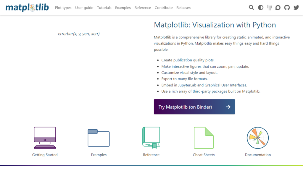
The strength of Matplotlib lies in its ability to create simple and complex publication-quality plots quickly. It has flexible and adjustable settings that help you customize your plots and tune them to your exact requirements. It also has robust support for different platforms, making plots accessible in various computing environments and interfaces.
Matplotlib is typically used in combination with NumPy and Pandas, making it part of a powerful data manipulation and visualization package. Matplotlib’s customizable and versatile plotting capacities have found a place in various scientific research fields, such as astronomy, bioinformatics, machine learning, and many more.
In the next section, we shall explore another powerful Python data visualization library, Seaborn, and discuss its features, benefits, and use-cases.
Plotly – another versatile Python library
Plotly is another versatile Python library used for data visualization. Unlike static graphs generated by other libraries, Plotly creates interactive graphs that allow users to zoom, pan, hover, and update graph visuals dynamically.
Plotly’s broad functionality and visually appealing graphics have made it popular not only among data professionals but also in business settings. The library creates unique and beautifully styled visualizations with little additional coding. These features make Plotly an ideal tool for both exploratory data analysis and creating graphs for presentations and reports.
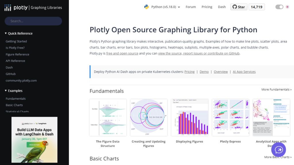
Plotly offers a range of plotting options, including line charts, bar charts, polar charts, scatter plots, 3D plots, geographic map data plots, and many more. It also provides functionality for creating sophisticated dashboards and multi-step animations, making it suitable for creating more complex visualizations.
One significant advantage of using Plotly is its seamless connection with Dash, an open-source framework for building analytical applications. Together, Plotly and Dash facilitate the creation of interactive web-based data visualization applications without any need for JavaScript.
Furthermore, Plotly also supports statistical model fitting via its integration with the SciPy stack, facilitating advanced statistical modeling and machine learning practices.
In conclusion, Plotly’s interactivity, aesthetics, and wide range of functionalities make it another staple in Python’s data visualization toolkit, applicable in diverse domains, from scientific research to business analytics.
Seaborn – a Python visualization library based on Matplotlib
Seaborn is a Python visualization library based on Matplotlib. It’s designed to create beautiful, informative statistical graphics. Seaborn stands out for its ability to create visually appealing, complex, and informative statistical graphics with minimal code.
While Matplotlib excels at creating simple plots, Seaborn simplifies the generation of more complex, meaningful plots, like heat maps, time series, and violin plots. Seaborn also integrates well with Pandas data structures, adding a layer of convenience for data scientists who primarily use Pandas for data analysis.
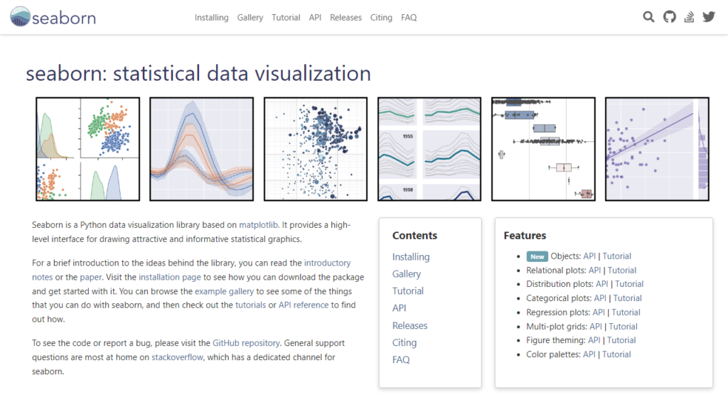
Seaborn offers a variety of visualization patterns, including single variable (univariate) plots, bivariate, and multiple variable (multivariate) plots. It is a great tool to perform exploratory data analysis (EDA), as it includes functions to visualize the distribution of data and the relationship between variables.
Seaborn provides a high-level interface to draw attractive statistical graphics. Its aesthetically pleasing default themes are one of its biggest advantages, as they allow even new users to create visually appealing plots quickly.
Seaborn’s rich, high-level interface, integration with Pandas, and compatibility with Matplotlib elevate visualizations beyond standard Matplotlib graphics and make it a critical tool for data visualization in Python. It finds use in a broad range of applications, from machine learning to social science research.
GGplot
GGplot, known as ggplot2 in R, is another potent Python visualization library. It is based on the Grammar of Graphics, a methodology that organizes complex graphics into a coherent system.
The main goal of GGplot is to allow for visual exploration of data, where graphics are built step by step in layers. This layer-by-layer approach makes it easier to add or remove visual features, providing a high degree of control for creating sophisticated, nuanced visualizations.
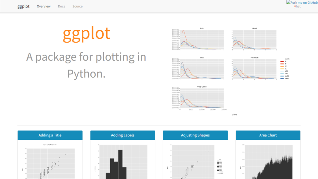
While GGplot does not offer a wide array of highly customizable charts like Matplotlib, it provides a more straightforward, consistent syntax. GGplot makes it easy to create complex plots by adding different geometric objects (like points, lines, and bars) and statistical transformations to the plot incrementally.
GGplot has a versatile set of themes, and it automatically adjusts the chart elements for good readability and aesthetics. This feature makes it a convenient tool for creating clean, professional graphs for presentations and reports with minimal tweaks.
GGplot finds use in a variety of fields such as statistical analysis, data science, and academia, where it is preferred for its elegance, simplicity, and high quality of its plots. However, it should be noted that the Python version of GGplot is not as extensively developed as its R counterpart and could lack some features.
In the coming sections, we will continue exploring other popular Python data visualization libraries and understanding their strengths and applications.
Altair
Altair is a relatively newer addition to the Python data visualization library roster, but it has quickly gained popularity due to its smooth operation, intuitive interface, and beautiful visuals. Altair was developed with a focus on simplifying the creation of complex and declarative visualizations.
It utilizes a simple syntax to generate graphics through a layered encoding of visualizations. This is based on the “grammar of graphics,” a system for describing and layering visual features of data. The syntax is simple and intuitive, allowing users to describe the visualization properties using Pandas DataFrames.
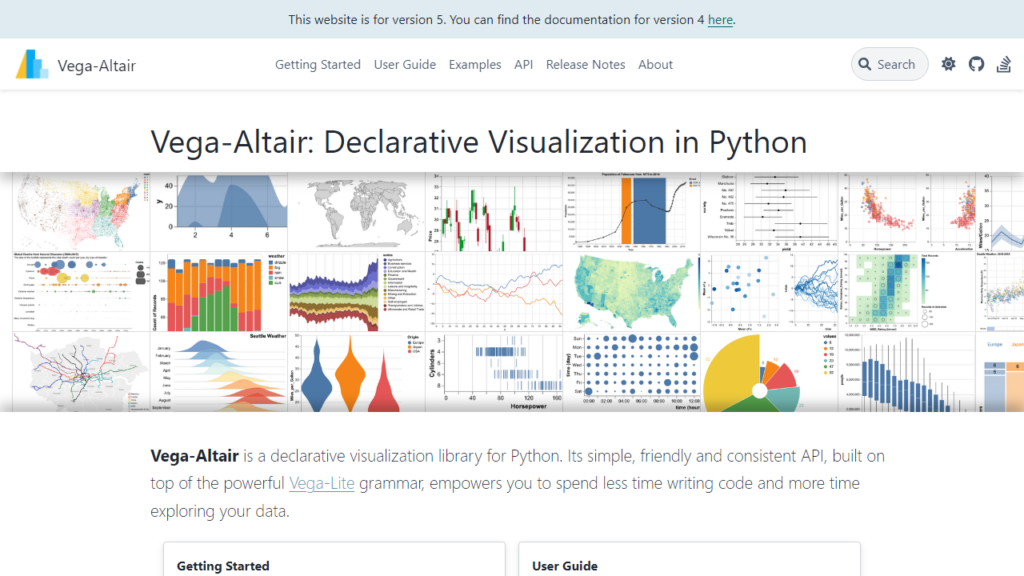
Like many others, Altair generates numerous types of visualizations, such as scatter plots, line charts, area charts, bar charts, error bars, box plots, histograms, heatmaps, and even more complex visuals. Notably, Altair generates interactive visualizations, allowing users to explore the relationships and patterns in the data dynamically.
Although Altair works well for smaller datasets, it can be significantly slower as the data size increases due to its unique design. Still, it remains a powerful choice for creating professional-quality, interactive graphics that visually narrate the story behind your data.
With its visually appealing and interactive plotting abilities, Altair has carved a distinct place in the Python visualization landscape. It is used across various fields, including business analytics, data science, machine learning, and academic research.
These libraries discussed above are just a handful of the numerous Python data visualization libraries available today. Depending on the complexity and objectives of your project, you may choose to use one or several of these libraries in combination to create comprehensive, interactive, and insightful visualizations.
Bokeh
Bokeh, another Python data visualization library, is specifically designed for creating interactive visualizations for use in modern web browsers. Its name, derived from a Japanese term for the aesthetic blur in out-of-focus areas of an image, reflects its focus on providing visual appeal in graphs.
Bokeh generates a wide array of graph types, including line, bar, scatter, and pie charts. It can also create maps, color bars, and other complex visualizations with high interactivity and scalability. With Bokeh, you can transform your data visualizations into engaging web applications without any need for JavaScript programming, though JavaScript callbacks for user interaction are supported.
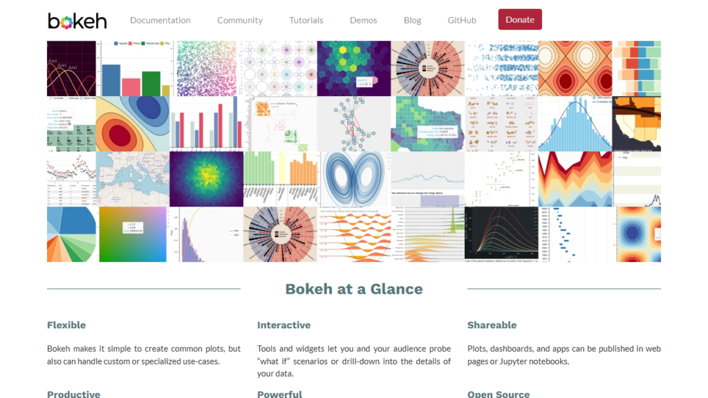
One of the strengths of Bokeh is its ability to render large datasets. It can handle streaming and real-time data, which makes it quite suitable for building complex dashboards and other applications where updates need to be reflected in real-time on the graphs.
Bokeh also integrates well with other Python libraries, such as NumPy, Pandas, and Seaborn, allowing these libraries’ data manipulation strengths to be combined with Bokeh’s visualization capabilities.
Bokeh’s interactivity and handling of large datasets make it a powerful tool for creating data visualizations in the Python ecosystem. It finds applications in various fields, from finance and economics, where real-time dashboard updates are crucial, to the geo-spatial industry, where large-scale data visualization is often required.
In the next section, we continue our exploration of Python visualization libraries with Folium, a library designed specifically for visualizing geospatial data.
Pygal
Pygal is a flexible Python package for creating slick, interactive, and scalable vector graphics. While it may not be as well known as Matplotlib or Seaborn, it shines in its ability to generate SVGs (scalable vector graphics).
Unlike pixel-based graphics, SVGs can scale to any size without losing clarity, making Pygal a great choice for creating visualizations that look sharp at any resolution. This feature makes Pygal particularly effective for web applications, where diagrams may need to be responsive to different screen sizes.
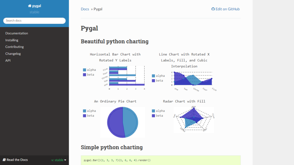
Pygal supports a wide array of common graphs, such as line charts, bar charts, pie charts, radar charts, dot charts, and many more. Despite the range of plots available, Pygal’s real strength lies in its simplicity. The library is easy to learn and use, making it a great choice for beginners and those looking for a way to quickly generate clean, responsive figures.
Besides, Pygal provides interactive features out of the box. Hovering over points and bars will give details, whereas clicking will provide links to more information. This level of interactivity can make graphs more useful and engaging on a website or application.
In conclusion, Pygal’s attractiveness lies in its simplicity and the ability to create attractive, interactive, and scalable graphics. It is a great tool for creating responsive graphics that work well on the web and in presentations.
This brings an end to our discussion of some of the most widely used Python data visualization libraries. As always, keep in mind that each library has its own advantages and disadvantages, so the complexity and particular requirements of your project should inform your library selection.
Geoplotlib
Geoplotlib is a Python library specifically designed for geospatial data visualization or geographic plotting. This library allows users to create maps and plot geographical data in a simple and intuitive way.
Geoplotlib provides several inbuilt tools for spatial data manipulations like k-means clustering, kernel density estimation, Voronoi tesselation, and more. Furthermore, it supports a variety of maps, including choropleths, heatmaps, and dot density maps, to represent geospatial data.
The most significant advantage of Geoplotlib is that it handles the details of displaying geographical data on maps, allowing you to easily overlay data on top of maps. This enables users to focus more on the data and less on the specifics of creating maps.
Another potential advantage is that Geoplotlib can handle big datasets and create interactive visualizations. These visualizations are compatible with Pyglet, an object-oriented programming interface, which makes it an excellent tool for rendering graphics.
In summary, Geoplotlib provides a high-level interface for visualizing geographical data in Python. It offers exciting opportunities to visualize, explore, and better understand geographical patterns in data across different fields, from public health and urban planning to environmental science and beyond.
Folium
Folium is a powerful Python library that helps you create several types of Leaflet maps. It makes it quick and easy to visualize data that’s been manipulated in Python on an interactive Leaflet map.
Based on leaflet.js, it is a powerful library for working with interactive maps. Folium enables both the binding of data to a map for choropleth visualizations as well as passing rich vector, raster, or HTML visualizations as markers on the map. Folium is a great tool to have in the geospatial toolkit, as it seamlessly integrates Python and Leaflet’s mapping capabilities.
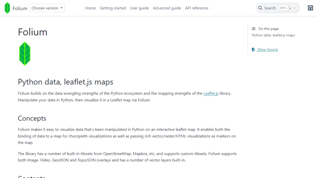
The library has a number of built-in tilesets from OpenStreetMap, Mapbox, and Stamen and also supports custom tilesets with Mapbox or Cloudmade API keys. Folium supports image, video, geojson, and topojson overlays.
Folium provides a simple interface to leaflet.js for creating sophisticated interactive maps, yet it’s very intuitive to work with. With a single line of code, you can generate a map, allowing you to rapidly create interactive visualizations with large amounts of data. Furthermore, Folium supports the creation of sophisticated mapping layers like choropleths and heatmaps with minimal effort.
In its essence, Folium is a powerful library that can help transform your geospatial analysis into an interactive, exploratory experience. It is widely used in earth sciences, social sciences, and other fields that require geospatial data analysis.
Gleam
Gleam is a Python library suited for visualizing dynamic and complex network structures. It leverages OpenGL and modern graphics processors to deliver real-time interactivity even on hundreds of thousands of nodes and edges.
While not as widely used as libraries like Matplotlib or Bokeh, Gleam stands out in its specialized domain. It is particularly noteworthy for its capacity to handle large graphs, the level of control it provides over visual properties, and the range of customization it allows.
Gleam is best used for creating high-quality static plots for inclusion in a paper, and it excels where Matplotlib can be a bit clunky when it comes to 3D data. It supports a wide variety of plot types, including scatter plots, bar plots, surface plots, and many more, and allows for deep customization of every aspect of a plot.
Moreover, Gleam’s powerful visualization capability extends to large datasets, while its capacity for interactive plotting provides additional flexibility for exploration and interpretation of complex data.
To conclude, Gleam is an excellent choice for 3D and complex network visualizations and is particularly well-suited for scenarios requiring advanced and dynamic visualization of large datasets. As always, it’s critical to select the visualization library that best matches your specific needs and the nature of your data.
Pandas
Pandas is not primarily a visualization library like Matplotlib or Seaborn, but it deserves mention for its powerful, high-level data manipulation capabilities, which also include basic plotting functions.
Pandas has quickly become an essential component of any data science workflow in Python. It makes importing, cleaning, manipulating, and analyzing data fast and easy. But beyond just being a powerful tool for data manipulation, Pandas also has built-in visualization capabilities derived from Matplotlib.
These built-in functions provide a quick and convenient interface to Matplotlib and are sufficient to create several basic visualizations such as bar charts, line plots, area plots, scatter plots, and more. With a single method call, users can plot their data directly from their DataFrame or Series objects.
Pandas also integrates seamlessly with other popular Python visualization libraries such as Seaborn, Plotly, and Bokeh, facilitating the creation of more advanced and interactive plots.
In summary, while Pandas may not be your go-to library for data visualization, its strong integration with other libraries and its own basic plotting capabilities make it a vital part of the data exploration process. Paired with its robust data manipulation utilities, Pandas remains a powerful tool in the Python data science toolkit.
Choosing the Right Python Data Visualization Library
With the wealth of Python data visualization libraries available, choosing the right one can seem daunting. However, the decision can be simplified by considering your data type and visualization needs.
1. Type and Size of Data: Different libraries have different strengths. For instance, libraries like Matplotlib and Seaborn are great for statistical analysis and common data visualizations. On the other hand, libraries like Plotly and Bokeh specialize in creating interactive plots, while Altair and Geoplotlib make geographic plotting a breeze. Libraries like Gleam specialize in complex 3D and network structures, while Pygal is known for creating interactive SVGs. However, as you work with larger data, libraries like Plotly and Bokeh may be more preferable due to their performance and interactivity advantages.
2. Static or Interactive: If you need simple, static graphs, Matplotlib could be a great choice, while libraries like Seaborn can help you quickly create more visually appealing charts. When interactivity is a priority, consider using libraries like Plotly, Bokeh, or Pygal, which are designed to create highly interactive plots. And if you’re working with geospatial data, libraries like Geoplotlib should be at the top of your list.
3. Purpose of Visualization: If the purpose of visualization is exploratory data analysis, libraries that provide various statistical charts and easy integration with machine learning libraries would be more suitable. However, if the visualization is intended for a presentation or web application, libraries creating interactive, visually appealing, and easy-to-understand charts would be preferable.
While the choice of library can significantly impact your productivity and the quality of your visualizations, remember that these tools are just means to an end. The most critical aspect of data visualization isn’t the tool you use, but how effectively you communicate the important insights within your data.
With this, we conclude our exploration of some of the top Python data visualization libraries. We encourage you to experiment with these libraries and leverage their unique capabilities to meet your specific data visualization needs. Happy plotting!
Conclusion
The ability to visualize and communicate data is incredibly important in today’s data-driven world. Python’s wide variety of robust data visualization libraries makes it an excellent tool for data analysis and storytelling.
As we have seen, each library caters to different needs and contexts: Matplotlib for simple graphs, Seaborn for statistical data, Plotly and Bokeh for interactive and sophisticated graphics, Pygal for creating SVGs, and Altair, Geoplotlib, and Folium for advanced geospatial visualizations. Gleam and Pandas add to the versatility of Python’s data visualization toolkit, each with their own unique capabilities.
While each of these libraries has its strengths and weaknesses, the choice of library should depend on the specific needs of your data visualization task. It’s important to remember that the tool does not make the visualizer; rather, it’s their understanding of the data and the story they wish to narrate that truly bring the data to life.
We hope this article has provided you with a deep understanding of Python’s data visualization ecosystem and how these libraries can aid you in your data analysis. So start exploring these libraries, create beautiful and insightful plots, and unearth the story your data is waiting to tell.

