Top Python Data Visualization Libraries: The Definitive 2026 Guide
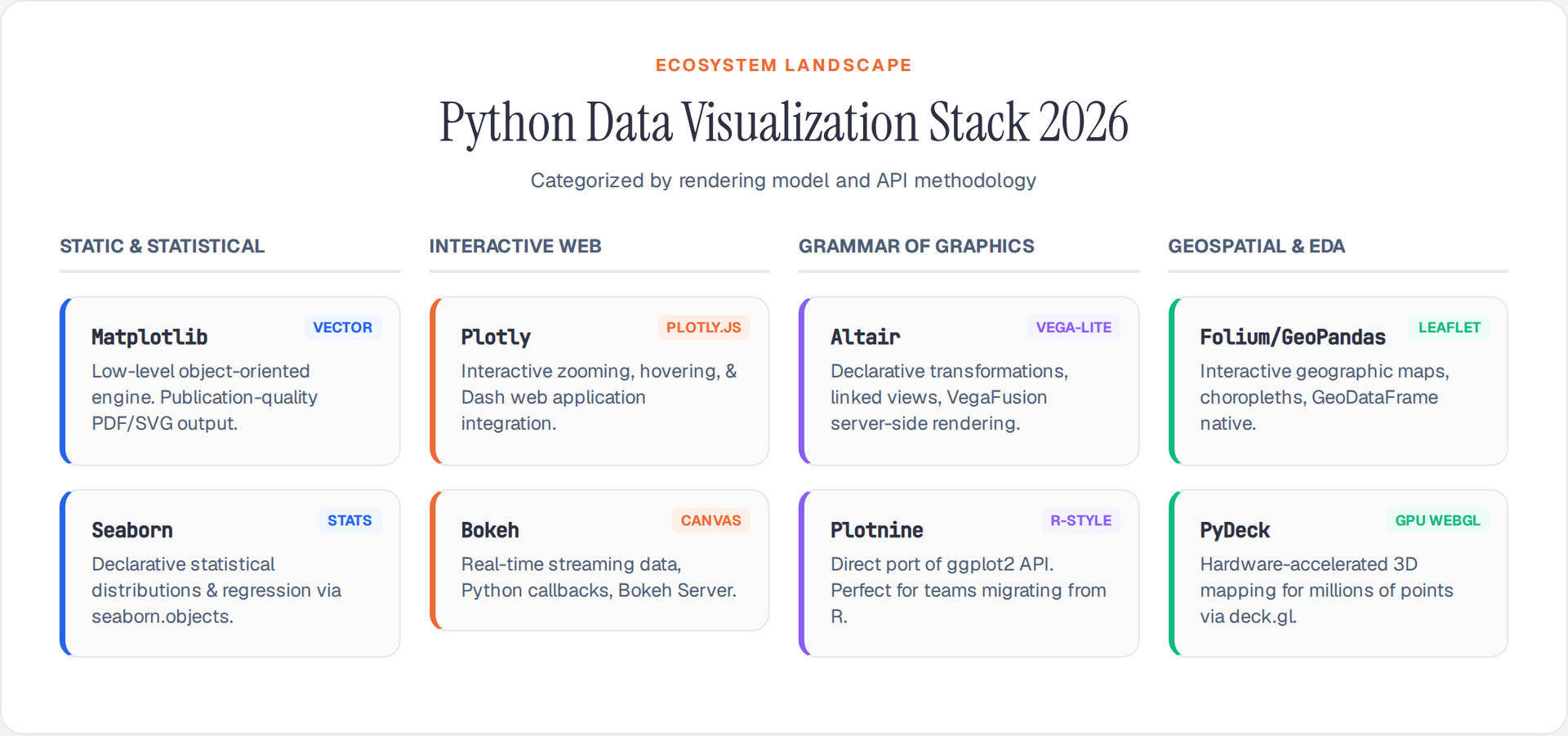
Python's visualization ecosystem in 2026 spans static publication-quality plots, GPU-accelerated dashboards, and declarative grammar-of-graphics APIs. Every library below ships with native PyArrow and Polars DataFrame interop, and most render directly inside JupyterLab 4.x and VS Code notebooks without configuration.
This guide covers the 10 most production-relevant libraries, organized by rendering model, with benchmarks and selection criteria.
1. Matplotlib: The Foundational Rendering Engine
Matplotlib 3.10+ remains the low-level substrate beneath Seaborn, Pandas .plot(), and scikit-learn visualization utilities. Its object-oriented API produces publication-quality vector output in PDF, SVG, and EPS.
import matplotlib.pyplot as plt
import numpy as np

# Modern constrained layout replaces tight_layout
fig, axes = plt.subplots(1, 3, figsize=(14, 4), layout="constrained")

x = np.linspace(0, 2 * np.pi, 200)
for ax, func, label in zip(axes, [np.sin, np.cos, np.tan], ["sin", "cos", "tan"]):
    ax.plot(x, func(x), linewidth=1.5)
    ax.set_title(label, fontsize=14)
    ax.set_ylim(-2, 2)

fig.suptitle("Trigonometric Functions — Matplotlib 3.10+", fontsize=16)
plt.savefig("trig_plot.svg", format="svg")
plt.show()
2026 highlights: layout="constrained" replaces manual tight_layout() calls, subfigure API enables nested grid layouts, and the mplstyle system supports dark-mode-aware stylesheets.
2. Seaborn: Statistical Visualization with Objects API
Seaborn 0.14+ introduced the seaborn.objects declarative interface, replacing the legacy function-based API. It produces statistical plots — distributions, regressions, categorical comparisons — with automatic Arrow dtype handling.
import seaborn as sns
import seaborn.objects as so
import pandas as pd

# Load PyArrow-backed dataset
df = pd.read_csv("flights.csv", dtype_backend="pyarrow")

# Objects API: declarative mark + stat composition
(
    so.Plot(df, x="month", y="passengers", color="year")
    .add(so.Line(), so.Agg("mean"))
    .add(so.Band(), so.Est("ci"))
    .label(title="Monthly Air Passengers — Seaborn Objects API")
    .show()
)
When to use: Exploratory data analysis, statistical summaries, distribution comparisons. Seaborn auto-selects appropriate statistical transformations and handles categorical ordering from Arrow dictionaries.
3. Plotly: Interactive Web-Native Charts
Plotly 6.x renders interactive charts via Plotly.js with zero JavaScript required. It supports hover tooltips, zoom, pan, lasso selection, and animated transitions natively in notebooks and Dash applications.
import plotly.express as px
import pandas as pd

df = pd.read_csv("gapminder.csv", dtype_backend="pyarrow")

fig = px.scatter(
    df.query("year == 2007"),
    x="gdpPercap", y="lifeExp",
    size="pop", color="continent",
    hover_name="country",
    log_x=True, size_max=60,
    title="GDP vs Life Expectancy (2007) — Plotly Express"
)
fig.show()
Dash integration: Plotly charts embed directly in Dash 3.x applications for production dashboards. plotly.io.to_html() exports self-contained HTML for embedding in blogs and reports.
4. Altair: Declarative Grammar of Graphics
Altair 5.5+ implements the Vega-Lite specification in Python. Charts are defined as data transformations rather than drawing commands, making complex multi-view compositions concise.
import altair as alt
import pandas as pd

df = pd.read_csv("stocks.csv", dtype_backend="pyarrow")

# Linked brushing across scatter + line views
brush = alt.selection_interval()

points = alt.Chart(df).mark_point().encode(
    x="date:T", y="price:Q", color="symbol:N"
).add_params(brush)

bars = alt.Chart(df).mark_bar().encode(
    x="mean(price):Q", y="symbol:N",
    color=alt.condition(brush, "symbol:N", alt.value("lightgray"))
).transform_filter(brush)

(points | bars).properties(title="Stock Prices — Altair Linked Brushing")
When to use: Multi-view coordinated dashboards, faceted exploratory analysis, and grammar-of-graphics workflows. Altair 5.5+ supports vegafusion for server-side aggregation of large datasets.
5. Bokeh: Streaming and Real-Time Dashboards
Bokeh 3.6+ renders interactive visualizations directly in the browser using its own BokehJS engine. It handles streaming data, real-time updates, and server-side Python callbacks.
from bokeh.plotting import figure, show
from bokeh.models import ColumnDataSource
import numpy as np

source = ColumnDataSource(data=dict(
    x=np.random.normal(size=500),
    y=np.random.normal(size=500),
    size=np.random.uniform(5, 15, 500)
))

p = figure(title="Real-Time Scatter — Bokeh 3.6+", width=700, height=400,
           tools="pan,wheel_zoom,box_select,reset")
p.scatter("x", "y", size="size", source=source, alpha=0.6, color="navy")
show(p)
When to use: Real-time monitoring dashboards, streaming sensor data, financial tick charts. Bokeh Server enables Python-backed interactivity without a frontend framework.
6. Plotnine: R-Style ggplot2 in Python
Plotnine 0.14+ is the most complete Grammar of Graphics implementation in Python. It mirrors R's ggplot2 API almost exactly, making it ideal for teams migrating from R.
from plotnine import ggplot, aes, geom_point, geom_smooth, theme_minimal
import pandas as pd

df = pd.read_csv("mpg.csv", dtype_backend="pyarrow")

(
    ggplot(df, aes(x="displ", y="hwy", color="class"))
    + geom_point(alpha=0.7)
    + geom_smooth(method="lm", se=False)
    + theme_minimal()
)
When to use: R-to-Python migration, academic publications, layered grammar-of-graphics workflows. Plotnine replaced the unmaintained ggpy (old GGplot) as the standard ggplot2 port.
7. Folium and GeoPandas: Geospatial Visualization
Folium 0.18+ wraps Leaflet.js for interactive maps. GeoPandas 1.0+ provides native .explore() for instant map rendering from GeoDataFrames.
import geopandas as gpd

# GeoPandas native interactive map
world = gpd.read_file("naturalearth_lowres")
world.explore(column="pop_est", cmap="YlOrRd", legend=True,
tooltip=["name", "pop_est"], tiles="CartoDB positron")
import folium

# Folium choropleth with GeoJSON overlay
m = folium.Map(location=[40.7, -74.0], zoom_start=10, tiles="CartoDB positron")
folium.Choropleth(
    geo_data="nyc_boroughs.geojson",
    data=df, columns=["borough", "median_income"],
    key_on="feature.properties.name",
    fill_color="YlGn"
).add_to(m)
m
When to use: Geospatial analysis, choropleth maps, point-density overlays. For static cartographic maps, use matplotlib with cartopy.
8. PyDeck and Kepler.gl: GPU-Accelerated Geospatial
PyDeck 0.9+ renders WebGL-accelerated 3D maps in notebooks. It handles millions of points with arc, hexagon, and scatterplot layers.
import pydeck as pdk
import pandas as pd

df = pd.read_csv("taxi_trips.csv", dtype_backend="pyarrow")

layer = pdk.Layer(
    "HexagonLayer",
    data=df, get_position=["lng", "lat"],
    radius=100, elevation_scale=4,
    extruded=True, pickable=True
)

view = pdk.ViewState(latitude=40.76, longitude=-73.97, zoom=11, pitch=45)
pdk.Deck(layers=[layer], initial_view_state=view).to_html("taxi_hex.html")
When to use: Large-scale geospatial (100K+ points), 3D elevation maps, trip-route visualizations. PyDeck renders via deck.gl and GPU hardware acceleration.
9. Pygwalker: No-Code Visual Exploration
Pygwalker 0.5+ turns any Pandas or Polars DataFrame into a Tableau-like drag-and-drop interface inside Jupyter notebooks. No charting code required.
import pygwalker as pyg
import pandas as pd

df = pd.read_csv("superstore.csv", dtype_backend="pyarrow")
pyg.walk(df)  # Opens interactive drag-and-drop explorer
When to use: Fast exploratory analysis without writing chart code, business stakeholder walkthroughs, dataset profiling.
10. Pandas Built-In .plot() and Plotting Backends
Pandas 2.2+ .plot() method wraps Matplotlib by default but supports swappable backends: plotly, hvplot, and altair.
import pandas as pd

df = pd.read_csv("sales.csv", dtype_backend="pyarrow")

# Default Matplotlib backend
df.groupby("region")["revenue"].sum().plot(kind="bar", title="Revenue by Region")

# Switch to Plotly backend for interactive output
pd.options.plotting.backend = "plotly"
df.plot.scatter(x="units", y="revenue", color="region", title="Units vs Revenue")
When to use: Quick one-liner plots during data exploration. Switch backends when interactivity or specific output formats are needed.
Library Selection Matrix (2026)
| Library | Rendering | Interactivity | Large Data | Best For |
|---|---|---|---|---|
| Matplotlib | Static/Vector | Minimal | Medium | Publication plots, PDF/SVG export |
| Seaborn | Static | Minimal | Medium | Statistical EDA, distributions |
| Plotly | Web/HTML | Full | Large | Dashboards, presentations, Dash apps |
| Altair | Web/Vega | Full | Medium* | Declarative grammar, linked views |
| Bokeh | Web/Canvas | Full+Server | Streaming | Real-time dashboards, monitoring |
| Plotnine | Static | Minimal | Medium | R migration, grammar-of-graphics |
| Folium | Web/Leaflet | Map | Large | Geospatial choropleth, points |
| PyDeck | WebGL/GPU | 3D | Very Large | 3D geo, millions of points |
| Pygwalker | Web/Tableau | Drag-drop | Large | No-code EDA, stakeholder demos |
| Pandas .plot() | Varies | Backend | Medium | Quick exploration one-liners |
*Altair with VegaFusion handles large datasets via server-side pre-aggregation.
Selecting the right library depends on three factors: output format (static PDF vs interactive HTML), data scale (thousands vs millions of rows), and audience (academic publication vs web dashboard vs notebook exploration). Most production pipelines combine two or three libraries — Matplotlib for exports, Plotly or Bokeh for dashboards, and Seaborn or Altair for analysis notebooks.
Author

Author