Best Data Visualization Tools in 2026: From No-Code Platforms to Production Dashboards
Selecting the right data visualization tool determines how fast teams move from raw data to actionable insight. In 2026, the market divides cleanly into four categories: no-code business platforms, code-first libraries, embedded analytics engines, and AI-augmented explorers.
This guide evaluates the 10 most production-relevant tools across pricing, data scale, collaboration, and deployment model.
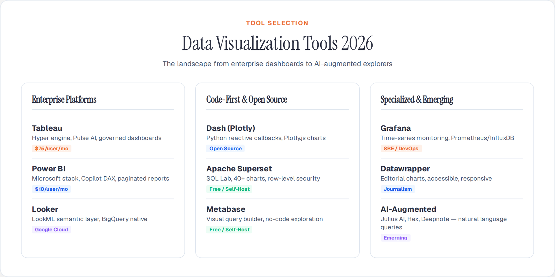
1. Tableau: Enterprise Visual Analytics
Tableau remains the dominant enterprise visualization platform with its drag-and-drop interface, Hyper engine for sub-second queries on billions of rows, and native Salesforce CRM integration.
Key capabilities (2026):
- Tableau Pulse: AI-driven automated insight detection that surfaces anomalies and trends without manual exploration
- Hyper engine: Columnar in-memory processing handles datasets exceeding 1 billion rows with sub-second response times
- Tableau Prep: Visual data preparation pipeline with reusable cleaning flows
- Deployment: Tableau Cloud (SaaS), Tableau Server (on-premises), Tableau Public (free, public-only)
Best for: Enterprise teams requiring governed dashboards, row-level security, and Salesforce/Snowflake/Databricks integration.
Pricing: Tableau Creator starts at $75/user/month; Tableau Public is free but all published work is public.
2. Power BI: Microsoft Ecosystem Integration
Power BI integrates natively with Excel, Azure, and Microsoft 365. Its DAX formula language powers complex calculated measures, and Direct Query mode connects to live data sources without import.
Key capabilities (2026):
- Copilot in Power BI: Natural language queries generate DAX measures and report pages automatically
- Dataflows Gen2: Serverless ETL pipeline built on Microsoft Fabric
- Paginated reports: Pixel-perfect PDF/print exports for financial and regulatory reporting
- Deployment: Power BI Service (cloud), embedded via Power BI Embedded API, Power BI Desktop (free authoring)
Best for: Organizations already invested in Microsoft 365, Azure SQL, or Dynamics 365.
Pricing: Power BI Pro at $10/user/month; Premium Per User at $20/user/month; Fabric capacity from $262/month.
3. Looker (Google Cloud): Semantic Layer Analytics
Looker uses LookML — a modeling language that defines metrics, dimensions, and relationships once — ensuring consistent definitions across all dashboards and embedded analytics.
Key capabilities (2026):
- LookML semantic layer: Single source of truth for metric definitions across the organization
- Looker Studio Pro: Self-service dashboard builder integrated with Google BigQuery
- Embedded analytics: White-label dashboard embedding via Looker API and SSO
- Deployment: Google Cloud native; integrates with BigQuery, Cloud SQL, Spanner
Best for: Data teams using Google Cloud who need a governed semantic layer and embedded analytics.
Pricing: Contact-based enterprise pricing; Looker Studio (basic) is free.
4. Plotly Dash: Code-First Interactive Dashboards
Dash is an open-source Python framework that combines Plotly.js charting with Flask web serving. Teams write dashboards as pure Python applications with reactive callbacks.
Key capabilities (2026):
- Plotly.js 6.x: 60+ interactive chart types including 3D surfaces, geographic maps, Sankey diagrams
- Dash Enterprise: Production deployment with authentication, app lifecycle management, Kubernetes scaling
- Dash AG Grid: High-performance data tables with sorting, filtering, and cell editing
- Deployment: Self-hosted via Docker/Kubernetes, or Dash Enterprise cloud
from dash import Dash, dcc, html, Input, Output
import plotly.express as px
import pandas as pd

app = Dash(__name__)
df = pd.read_csv("sales.csv", dtype_backend="pyarrow")

app.layout = html.Div([
    dcc.Dropdown(id="region", options=df["region"].unique(), value="East"),
    dcc.Graph(id="chart")
])

@app.callback(Output("chart", "figure"), Input("region", "value"))
def update(region):
    filtered = df.query("region == @region")
    return px.bar(filtered, x="product", y="revenue", title=f"Revenue — {region}")

app.run(debug=True)
Best for: Data science teams building custom analytical applications in Python without learning a frontend framework.
5. Metabase: Open-Source Self-Service BI
Metabase provides a no-code query builder that lets non-technical users explore databases visually. It auto-generates filters, drill-downs, and pivot tables from database schema metadata.
Key capabilities (2026):
- Question builder: Visual query interface — no SQL required for basic exploration
- Native query mode: Full SQL editor with variable parameters and result caching
- Embedding: iframe and JWT-authenticated embedding for SaaS products
- Deployment: Docker self-host (free), Metabase Cloud (hosted), Metabase Enterprise
Best for: Startups and mid-size companies that need analysts and PMs to self-serve data exploration without writing SQL.
Pricing: Open-source (free self-host); Metabase Cloud from $85/month; Enterprise from $500/month.
6. Grafana: Infrastructure and Observability Dashboards
Grafana specializes in time-series monitoring: server metrics, application performance, IoT sensor streams, and SLO tracking. It connects to 100+ data sources including Prometheus, InfluxDB, Elasticsearch, and CloudWatch.
Key capabilities (2026):
- Grafana Alerting: Unified alerting across all data sources with routing, silencing, and escalation
- Grafana Loki: Log aggregation with label-based indexing (not full-text)
- Tempo: Distributed tracing backend with trace-to-metrics correlation
- Deployment: Self-host (free OSS), Grafana Cloud (managed), Grafana Enterprise
Best for: DevOps, SRE, and platform engineering teams monitoring infrastructure and application performance.
Pricing: Grafana OSS is free; Grafana Cloud free tier includes 10K metrics series; Pro from $29/month.
7. Datawrapper: Editorial and Journalism Charts
Datawrapper is purpose-built for newsrooms and content teams. It produces clean, responsive, accessible charts optimized for embedding in articles with mobile-first responsive behavior.
Key capabilities (2026):
- Chart types: Bar, line, area, scatter, range plots, election maps, locator maps, data tables
- Accessibility: ARIA labels, keyboard navigation, screen-reader-friendly SVG output
- Responsive: Charts resize and reflow for mobile without configuration
- Deployment: Web-based SaaS; embed via iframe or responsive script tag
Best for: Journalists, content marketers, and editorial teams embedding charts in web articles.
Pricing: Free tier (1 chart/month); Team plan from $599/month.
8. Observable: Reactive Notebooks for Data Stories
Observable combines JavaScript notebooks with D3.js-powered visualizations. Its reactive runtime automatically re-executes dependent cells when inputs change.
Key capabilities (2026):
- Observable Plot: High-level charting library built on D3 with concise mark-based API
- Observable Framework: Static-site generator for data dashboards with built-in data loaders
- Database connectors: Direct SQL queries to Snowflake, BigQuery, Postgres, DuckDB
- Deployment: Observable Cloud (hosted notebooks), Framework (self-hosted static sites)
Best for: Data journalists, frontend engineers, and teams publishing interactive data stories on the web.
9. Superset (Apache): Open-Source Enterprise BI
Apache Superset is a modern, open-source BI platform that supports rich SQL-based exploration with an intuitive chart builder and dashboard composer.
Key capabilities (2026):
- SQL Lab: Full-featured SQL IDE with query history, saved queries, and result visualization
- 40+ chart types: Time-series, geographic, pivot tables, box plots, sunbursts, treemaps
- Role-based access control: Row-level security, dataset permissions, dashboard-level access
- Deployment: Docker Compose, Kubernetes Helm charts, Preset Cloud (managed SaaS)
Best for: Engineering-driven organizations seeking a free, self-hosted BI platform with enterprise security controls.
Pricing: Open-source (free); Preset Cloud (managed) from $20/user/month.
10. AI-Augmented Tools: Julius, Hex, and Deepnote
The newest category combines notebook-style analysis with AI copilots that generate charts, write SQL, and explain patterns from natural language prompts.
Julius AI: Upload a CSV, ask a question in plain English, get an interactive chart. No code, no configuration. Best for non-technical stakeholders.
Hex: Collaborative data notebooks with Python, SQL, and AI cells. Supports reactive app mode for publishing interactive reports. Best for data teams combining code-first analysis with shareable dashboards.
Deepnote: Jupyter-compatible cloud notebooks with real-time collaboration, scheduled runs, and AI code generation. Best for data science teams migrating from local Jupyter workflows.
Tool Selection Decision Framework
| Need | Primary Tool | Runner-Up |
|---|---|---|
| Enterprise governed dashboards | Tableau | Power BI |
| Microsoft-native stack | Power BI | Looker Studio |
| Google Cloud / BigQuery | Looker | Superset |
| Python-coded dashboards | Dash (Plotly) | Streamlit |
| Non-technical self-service | Metabase | Hex |
| Infrastructure monitoring | Grafana | Datadog |
| Editorial chart embedding | Datawrapper | Flourish |
| Interactive data stories | Observable | D3.js |
| Open-source enterprise BI | Superset | Metabase |
| AI-first exploration | Julius / Hex | Deepnote |
The right tool depends on three constraints: who builds (engineers vs analysts vs stakeholders), where data lives (cloud warehouse vs local files vs streaming), and how output is consumed (internal dashboards vs embedded analytics vs published articles). Most mature teams maintain two or three tools from different categories to serve different audiences across the organization.
Author

Author